iOS 7, Apple’s latest Operating System for their iDevices, refreshes the stale design of its predecessor but in the process it takes influences from the competitors it has alleged were copying its IP. Now the iOS 7 is copying the copiers, oh the irony.
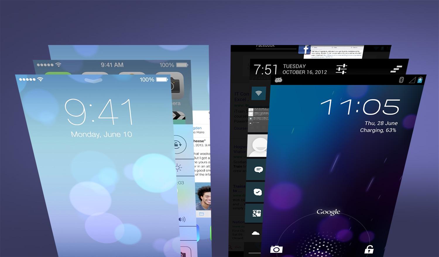
Notifications
iOS’ notification setup has always had low critical response form the tech press, in 2011 when iOS ripped off Google’s -who first ripped off some concepts form the belated Palm’s much loved webOS – pull down and swipe notification drawer.
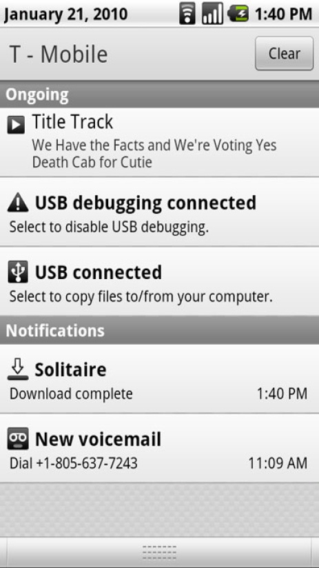
Android 2.x notification drawer, iOS 5 notification pull down on the left.
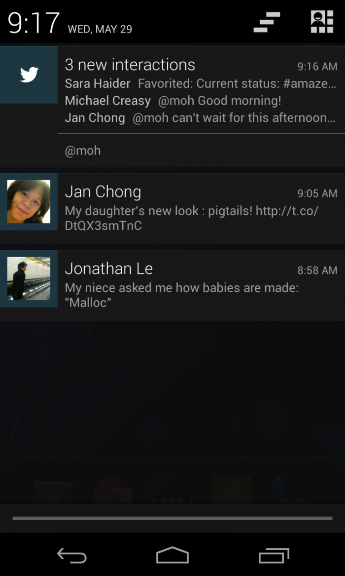
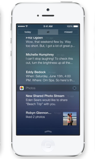
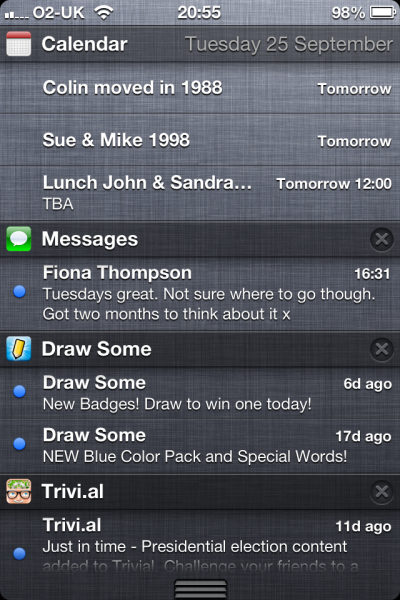
Android Jellybean Notifications with previews on the left, iOS7 pull down notifications on the right.
Multitasking
iOS doesn’t really have multitasking for non-core apps, so this will change in iOS7, like Webos and android have been doing for years. That aside the UI is an amalgamation of concepts from Webos, android and Windows phone 7, Webos was the first to use “cards” for represent apps in an out-of-focus mode when switching between then. iOS has applied these concepts to their new task switcher, card view per Webos and the Icons like android.
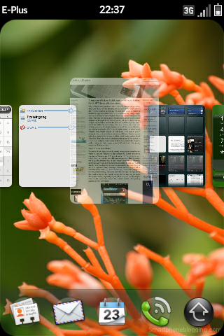
Webos card view on the left, android ICS and up task switcher on the right.
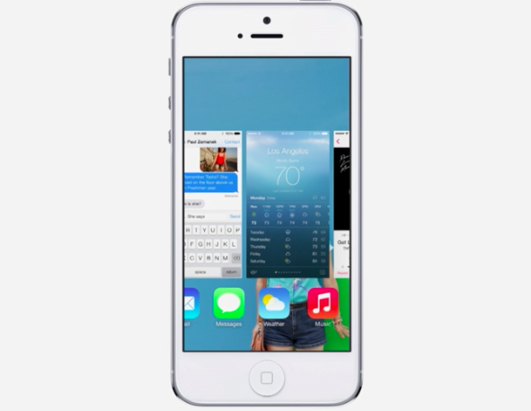
iOS7 task switcher, some elements of Webos and Android.
Squircles
A design Nokia was harping on during the end of anna, Belle and Maemo for the ill-fated Pureview 808 and N9. The squircles are just very rounded corners for the icons, not really a big deal, but it seems inspiration can come from anywhere.
![]()
The Nokia design does have a wider radius but it is very similar.
Blurs
iOS7 will feature blurred backgrounds for the pop out/up windows and overlays.

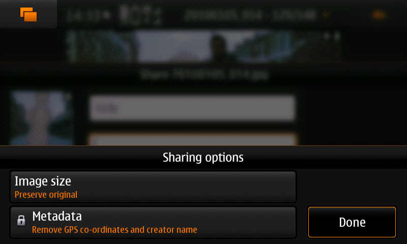 The Nokia n900 used blurs to highlight menu overlays.
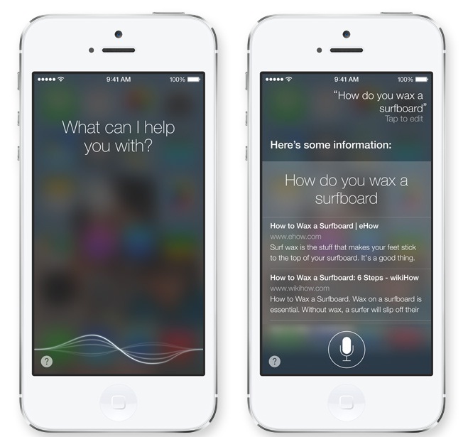
In this image, Apple uses a blur to emphasize the Siri overlay.
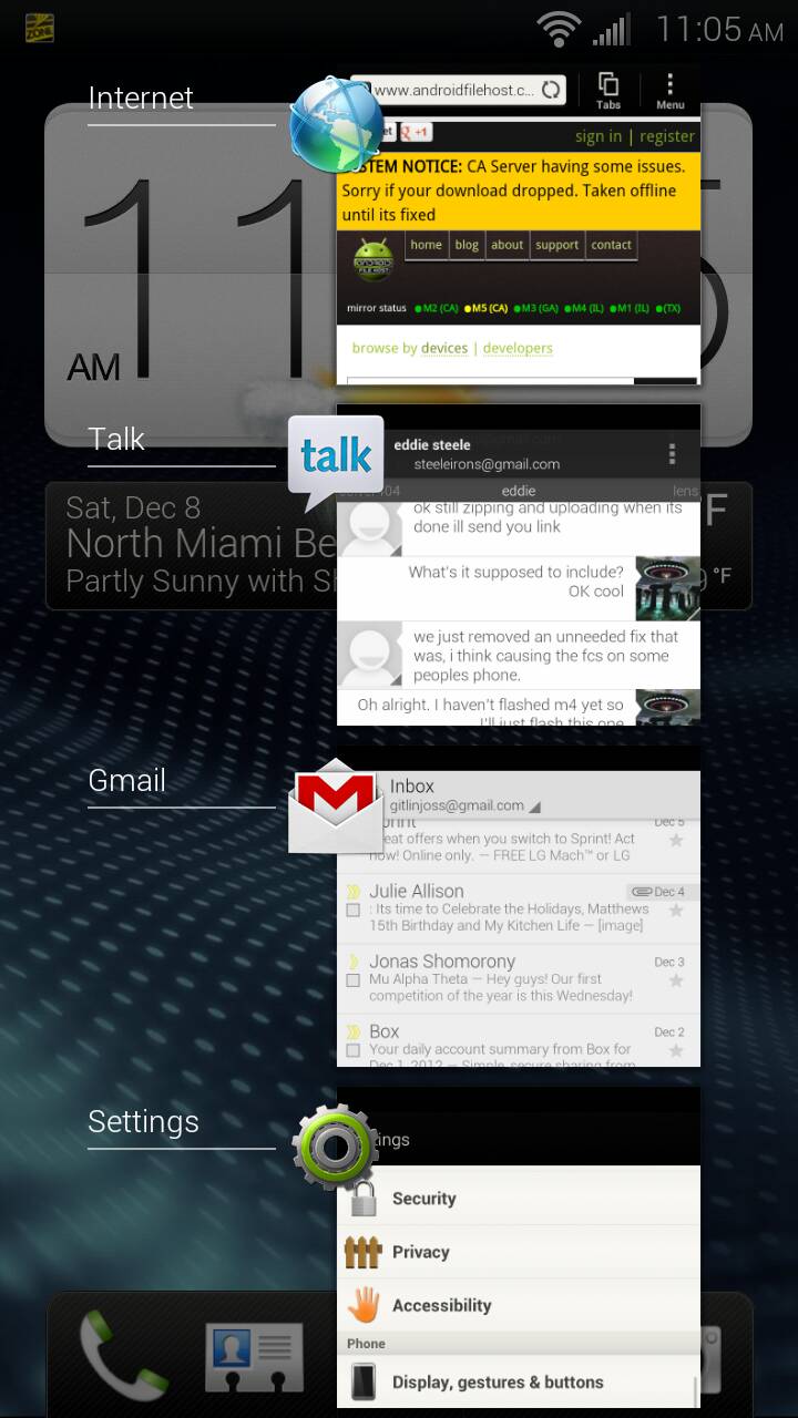
Quick Settings
iOS has always lacked a quick way to adjust commonly used settings, iOS 7 just introduced a swipe up overlay for quick toggles, like Bluetooth and airplane mode -among others. This reminds me of what Samsung has been doing for quite some time, even Webos had a quick settings menu accessible from anywhere in the OS.
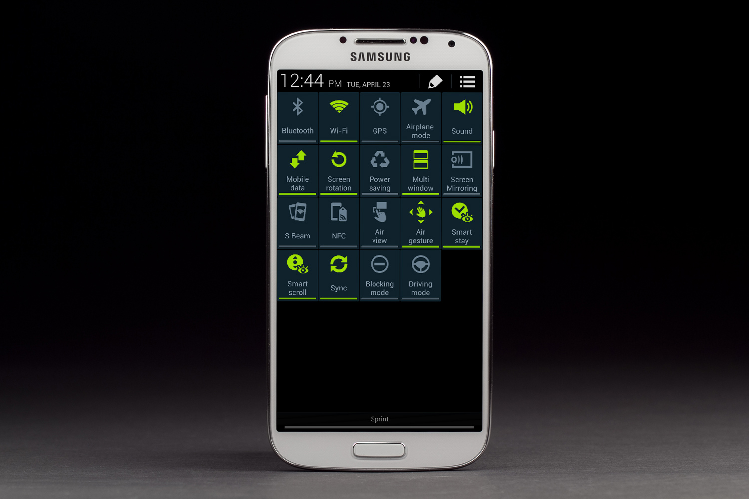
Samsung goes all out with an option to have all available toggles on the pull down menu.
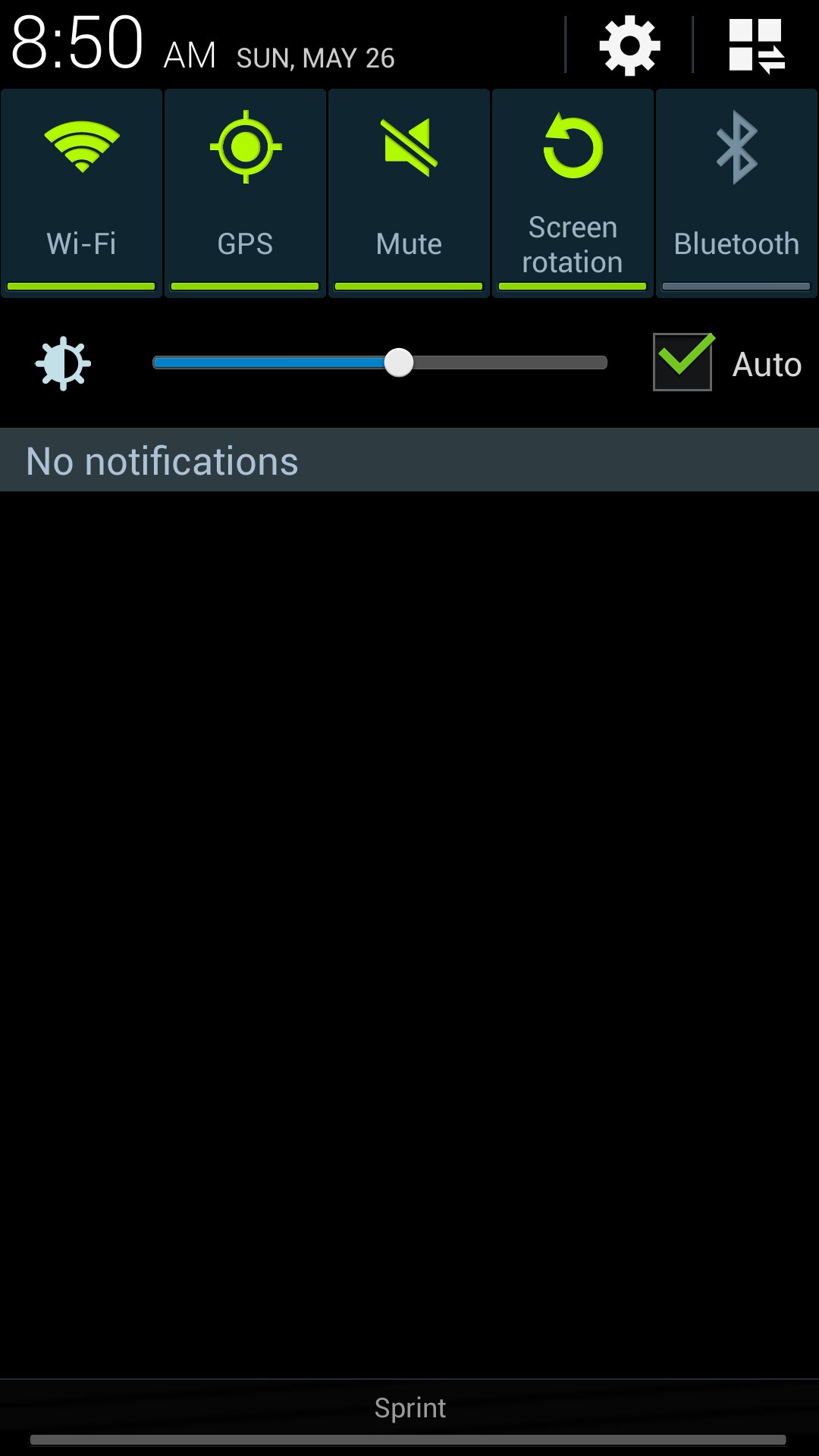
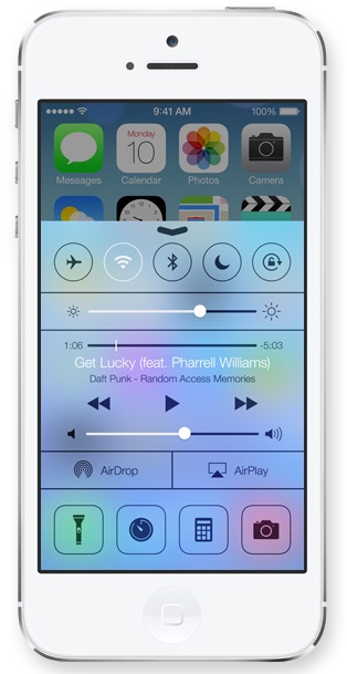
Samsung default quick toggle pull down on the left, iOS7 quick toggles on the right.
Wallpaper and theme behaviors
iOS7 has added a few additional behaviors to there theming and wallpaper system. The wallpaper itself will influence the colors represented in the menus as well, not unlike Jolla’s implementation. iOS7 will also have a live wallpaper that adjusts the pitch of the image depending on input given by its sensors. While Google hasn’t directly made a live wallpaper like this, all the hooks are there and many third parties have been doing this for years.
Conclusion
I think most people criticizing Apple over copying or being “heavily inspired” from other platforms, like Android, webOS, Belle and WP8, do it not because they don’t realize that this is how platforms evolve, especially in a mature market, by building similar features to compete, but because Apple has been so hypocritical about all of this. Not only do they brag about how innovative they are, but they also tend to sue others whenever their designs are even remotely close to theirs.


